UX/UI Designer
Lily’s Sweets
Make Life Sweeter.
Lily’s Sweets – Responsive Ecommerce Redesign
As Lead UX/UI Designer, I defined the research strategy, designed the ecommerce architecture, and delivered a responsive platform that balanced B2C emotional engagement with B2B efficiency. The redesign increased online product discovery, streamlined checkout, and aligned with the brand’s modern visual identity.

SCOPE OF WORK
—
Role:
Lead UX/UI Designer
Scope:
UX Research, User Flows, Wireframes, Responsive UI Design
Tools:
Figma, Sketch, OptimalSort, InVision
Team:
Collaborated with marketing, ecommerce vendor, and in-house dev team
OBJECTIVE
—
Primary Challenge:
Integrate a new ecommerce platform without disrupting B2B workflows, while visually elevating the brand for consumer appeal.
Business Goals:
Increase direct-to-consumer online sales. Maintain quick reorder path for wholesale buyers. Launch new product lines with minimal design/dev overhead via modular components
Solution Highlights:
Designed “Recipe + Featured Items” modules to boost cross-sell opportunities and promote seasonal product launches.

DESIGN CONSIDERATIONS
—
Recognized distinct audience needs:
• B2C shoppers are motivated by rich visuals, brand storytelling, and browsing.
• B2B buyers value speed, familiarity, and minimal clicks.
This informed a dual-path navigation strategy: immersive product discovery for B2C and a streamlined, repeat-order path for B2B.

USER RESEARCH
—
Delving into user understanding within these contexts demands a nuanced strategy, recognizing the unique challenges that each sector encounters. The research phase of the project involved site visits; contextual interviews; competitive analysis; information architecture (card sorting); site mapping and user interviews.
B2C IN-STORE
Conducting customer interviews proved invaluable in gaining insights into the preferences between in-store and online shopping experiences. The findings revealed a general preference among customers for in-store shopping due to its convenience, especially for local residents. Additionally, customers expressed a fondness for the tactile and visual aspects of the in-store experience, where they could see and interact with products up-close.
Summary:
Customers prefer in-store shopping, they perceive it as a more convenient option.
Customers value the hands-on and visual aspects of in-store shopping, allowing them to closely interact with products.
B2C ONLINE
Research extended to an exploration of online stores, with a specific focus on direct competitors. This deep dive into their online features aimed to uncover industry conventions. However, while this feature comparison served as a solid starting point for competitor analysis, I recognized the need for a more comprehensive understanding of their online customer experiences. This approach proved instrumental in identifying elements that I wanted to integrate into the design while also confirming aspects that were not considered desirable.
Approach:
Utilizing large imagery alongside products proves to be a powerful tool for enhancing the product presentation and bringing it to life.
Simple navigation ensures easy access to a diverse range of product, while a clear user flow guides visitors through every step, from product discovery to checkout.

Site Flow
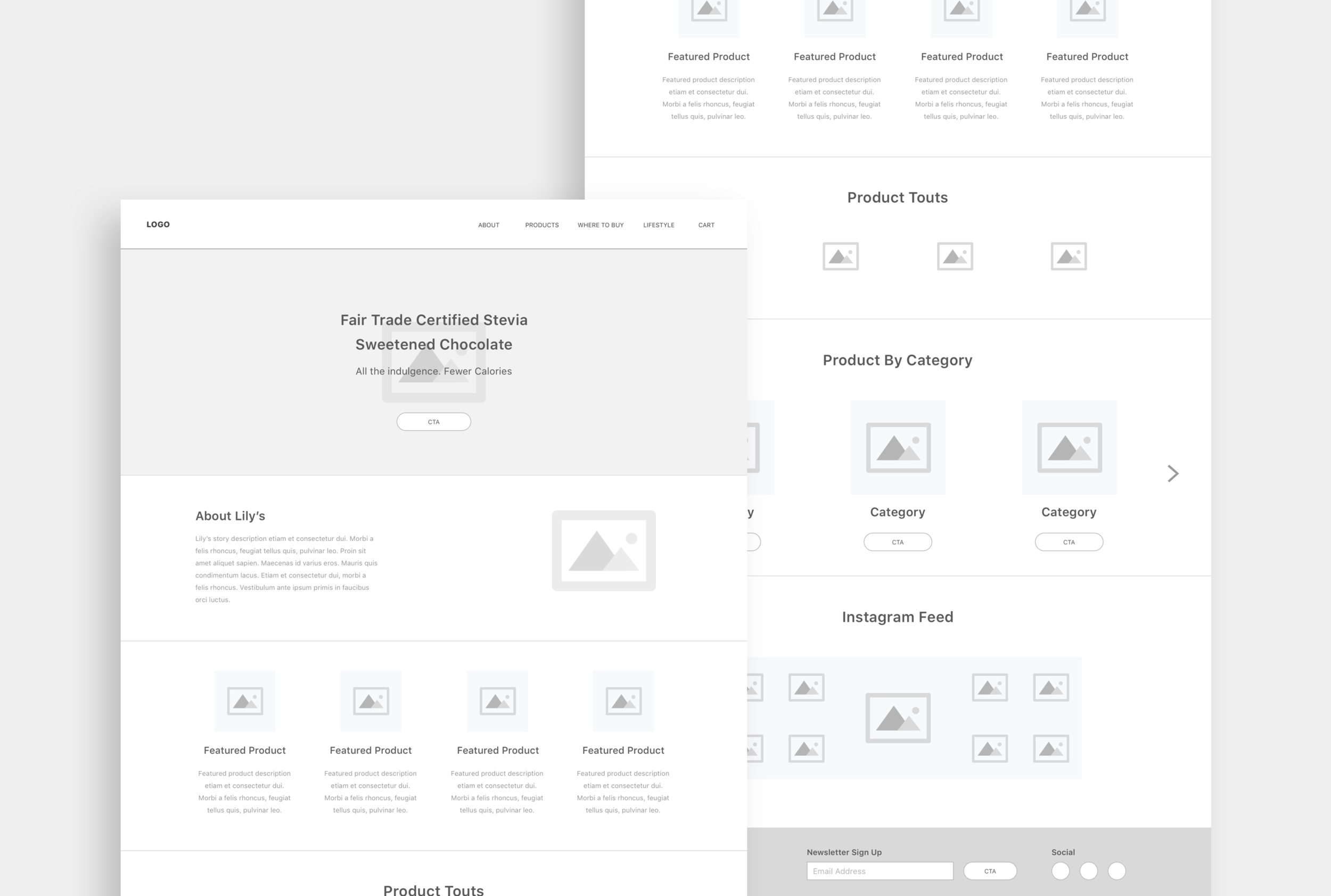
Homepage hero with seasonal product promotion module

Site Map

Product detail page with large imagery + recipe-based cross-sell component
KEY TAKEAWAYS
—
Results & Impact:
• Reduced checkout steps from 5 → 3, decreasing cart abandonment (-30%).
• Introduced cross-sell modules, increasing average order value (+18%).
• Designed modular homepage allowing marketing to launch seasonal promos without design cycles.
Reflection:
This project reinforced my approach of designing for adaptability — ensuring solutions scale across audiences and evolving product lines.