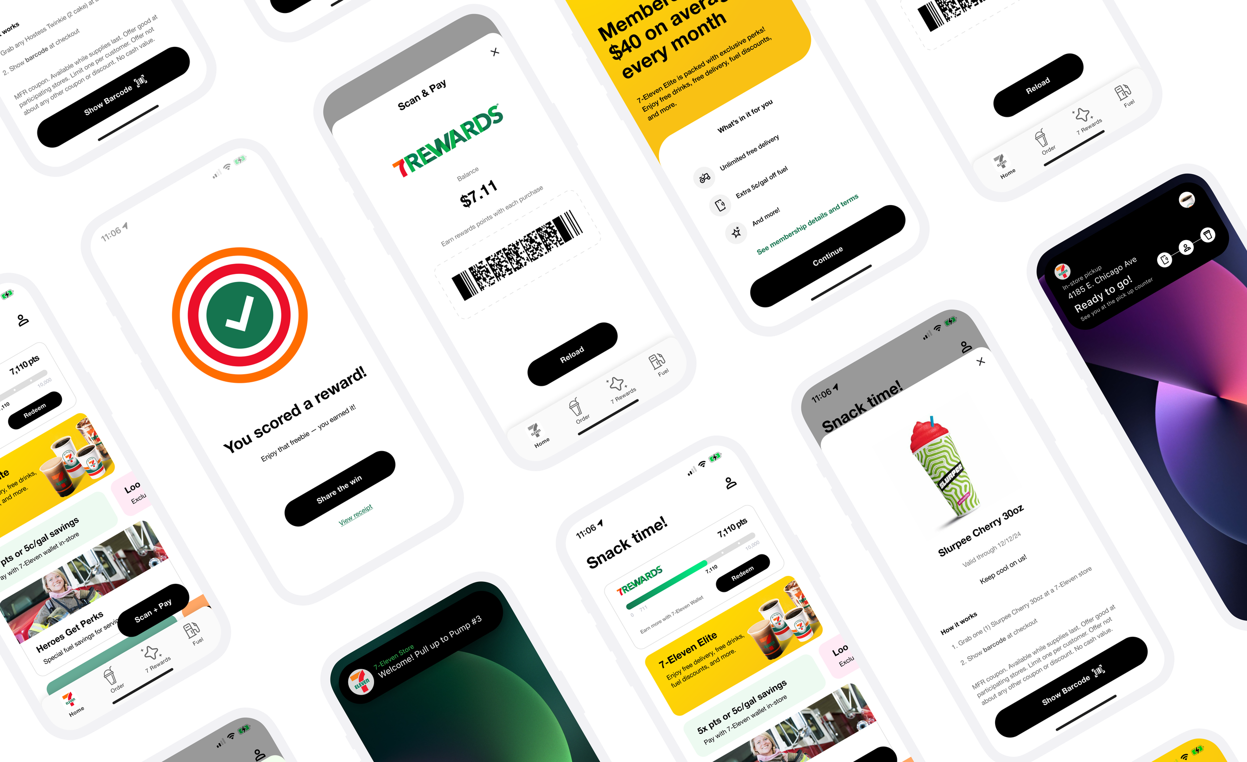
7-Eleven
Oh, Thank Heaven.
7-Eleven Mobile – Smarter Checkout, Seamless Rewards
7-Eleven’s app is the bridge between millions of customers and their next snack, coffee, or fuel stop. But even with a full loyalty program and modern payment options, the experience wasn’t always surfacing the right value at the right time.
I led a small design team to improve three high-impact features — sharpening the loyalty experience, making everyday actions faster, and bridging the gap between the physical store and the digital app.
SCOPE OF WORK
—
Role & Team
Lead UX/UI Designer — Collaborated cross-functionally with product, engineering, QA, and marketing stakeholders. Guided the vision and execution of feature enhancements end-to-end, from early concepts to high-fidelity UI. Prioritized design decisions that balanced user needs with measurable business impact.
Project Summary
Redesigned the Smart Rewards Dashboard with context-aware Quick Actions (iOS Dynamic Island) and frictionless Apple Wallet checkout. The goal: make rewards, in-store actions, and checkout faster and more intuitive to drive engagement and repeat visits.
Design Challenge
Core features like rewards, Scan & Go, and fuel perks were hard to find, lacked real-time feedback, and didn’t align with native iOS patterns — resulting in low visibility and friction in usage.
Impact Goals
Increase loyalty redemptions
Reduce checkout abandonment
Drive cross-service adoption
Strengthen 7-Eleven’s digital experience
Tools
Figma, FigJam, iOS HIG, Zeplin, Adobe CC
“Designing convenience that’s faster, clearer, and more rewarding — in-store, at the pump, and on the lock screen.”
Smart Rewards Dashboard
—
Before
Rewards were scattered across different areas of the app, requiring customers to tap through multiple screens before they could even see their points balance or available offers.
There was no live status indicator, so customers didn’t know if a deal was still active, had expired, or had already been redeemed — leading to uncertainty and, in some cases, frustration at the counter.
The redemption process itself took too many steps and ended abruptly, without any satisfying feedback or sense of accomplishment.
After
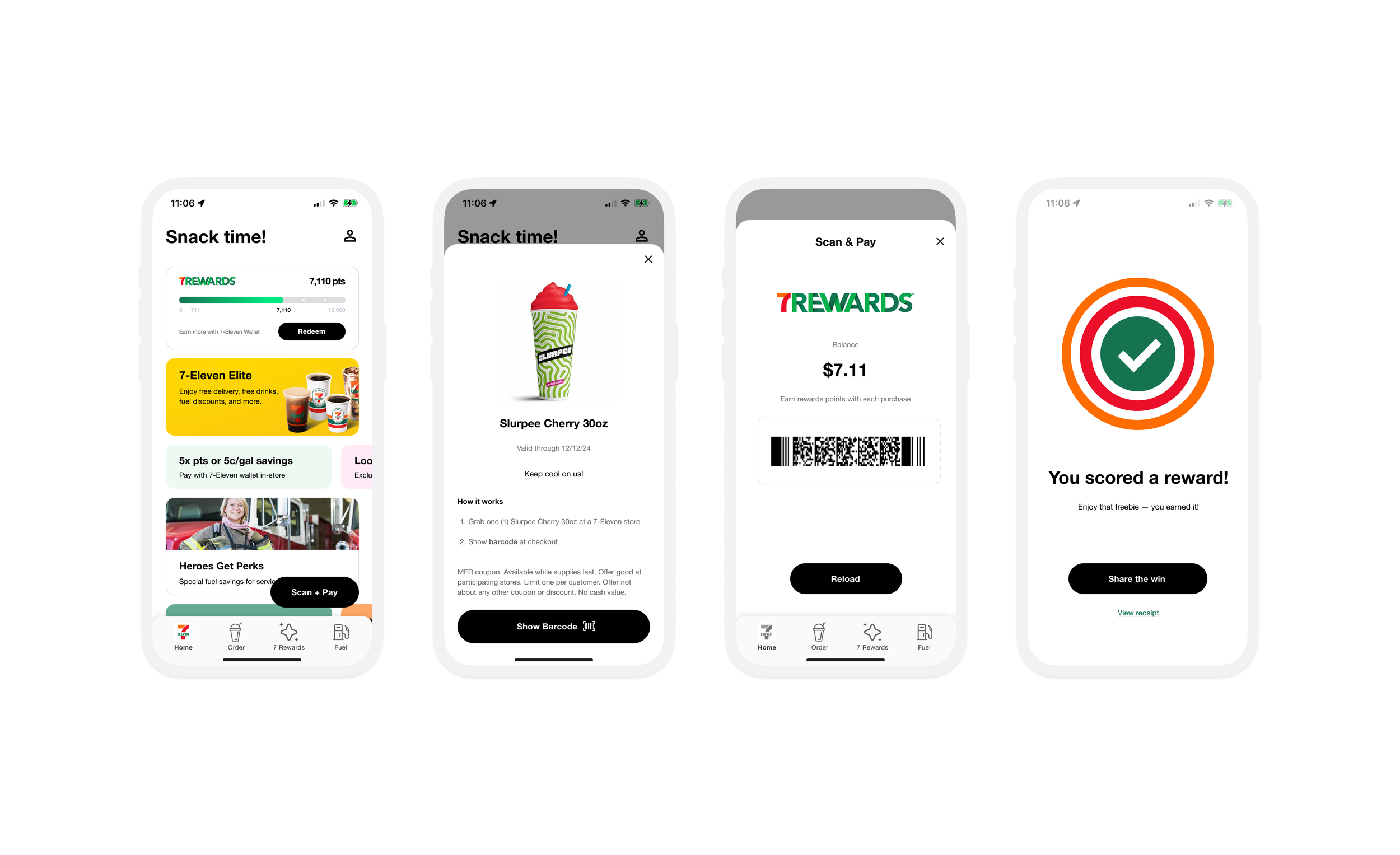
Unified Rewards Hub placed front and center on the home screen, consolidating points, offers, and progress into a single glanceable module. No more hunting — customers could open the app and immediately see their rewards status.
Real-time updates that sync instantly after purchases, paired with clear visual states for Available, Expiring Soon, and Redeemed, so customers always know exactly where they stand.
One-tap redemption with large, thumb-friendly CTAs, haptic feedback, and a playful celebratory animation that adds a moment of delight.
Progress tracker showing how close customers are to their next reward, paired with timely push notifications that nudge them to visit again before an offer expires.
High UI mockup of the home screen Rewards Hub showing points total, progress bar, and swipeable offer cards with badge states.
Detail screen mockup with “Redeem Now” CTA and animated confirmation state.
Impact
+22% reward redemption rate in the first quarter after launch.
35% fewer support tickets related to rewards confusion or missing offers.
Higher DAU as users returned more frequently to check progress and discover new rewards.
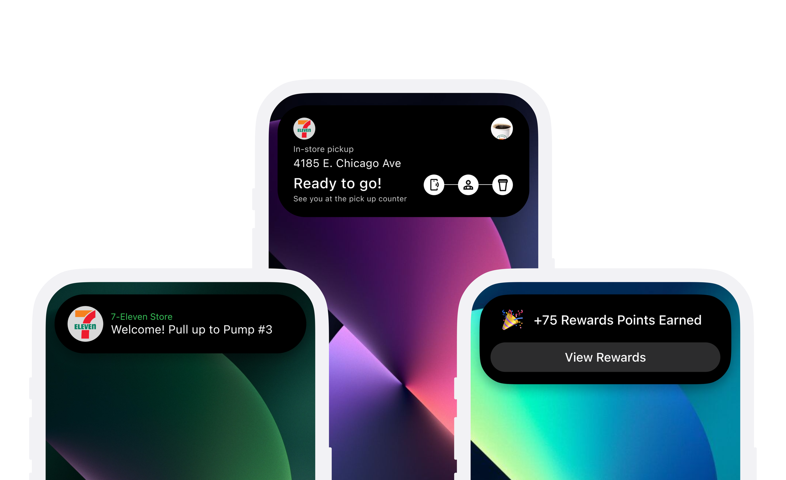
In-app Action Bar states for approaching store, in-store, and pump. Dynamic Island expanded and compact mockups showing context-driven quick actions.
Location-Based Quick Actions + Dynamic Island
—
Before
Customers arriving at a store or fuel pump still had to dig through the app to find basic actions like Scan & Go, Fuel Rewards, or Order Ahead.
The app wasn’t context-aware, so even in high-intent moments, the most relevant actions were buried several taps deep.
After
Context-Aware Action Bar built into the home screen, showing three pill-shaped quick action chips that adapt based on the customer’s location and situation:
Approaching a store: Order Ahead, Scan & Go, Directions.
In-store: Scan & Go, Redeem Reward, Find Item.
At pump: Fuel Rewards, Pay for Gas, Store Info.
Dynamic Island integration in iOS 18 that brings these quick actions out of the app entirely, so customers can start a task right from the top of their screen. For example:
Approaching a store: Island expands with Order Ahead and Directions.
At the pump: Compact state shows “Fuel Rewards Applied” and one-tap Pay Now.
In-store: Loyalty barcode is instantly accessible without unlocking the phone.
Impact (Projected)
+10–14% increase in initiation of key actions during peak moments.
1–2 fewer taps to complete time-sensitive tasks.
More cross-service usage as customers easily move between fuel and in-store transactions.
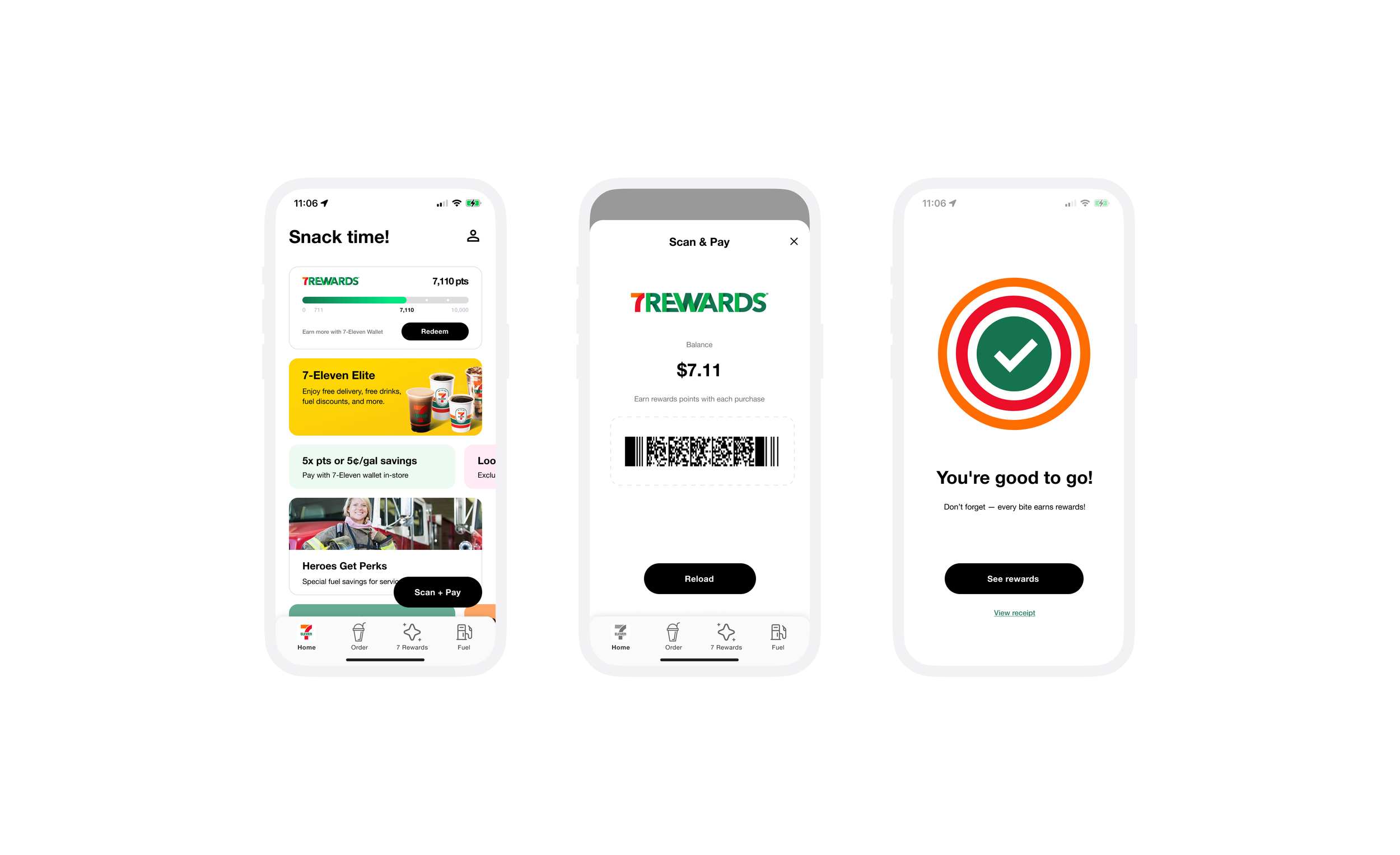
[Vis + Descrip] Scan & Go flow mockups: home → scan view with progress bar → payment sheet → animated success screen. Apple Wallet loyalty card with scannable barcode, points balance, and pay button.
Frictionless Quick Checkout + Wallet Integration
—
Before
Even customers familiar with Scan & Go had to find it first, often digging through the app at the counter.
The checkout flow offered little feedback while scanning, and no safety net if something went wrong mid-purchase.
After
Persistent “Scan & Go” button that’s always in reach on the home screen, eliminating the need to search.
Inline scanning experience that overlays a full-width camera view, showing product names, prices, and a progress bar that fills with each successful scan.
One-tap payment with a clear summary and instant success state — a big green checkmark, a short animation, and a scannable digital receipt barcode for peace of mind.
Apple Wallet quick access:
Loyalty barcode and default payment card stored in Wallet, appearing automatically on the lock screen when near a store.
Double-click side button to scan or pay without even opening the app.
Deep link into Scan & Go for customers who want to complete the full in-app flow.
Recovery paths for offline mode or failed payments, ensuring customers can always finish their transaction.
Impact (Projected)
+17% Scan & Go adoption after launch.
15% fewer abandoned checkouts due to faster access and clear progress.
Checkout time reduced from ~15 seconds to as little as 3–5 seconds with Wallet access.
Outcomes & Reflection
Surface value before the user even looks for it—meeting customers at the right moment.
Reduce friction across the journey, from store entry to checkout.
Build trust and repeat use with clear feedback, responsive UI, and native iOS integrations.
Business Value: More redemptions → more visits → higher average ticket size.
User Value: Faster, clearer, and more rewarding every trip.
This work was about meeting customers where they are—app, store, pump, or lock screen—and making every step feel natural and anticipatory. By blending loyalty, speed, and a little delight, 7-Eleven’s mobile experience becomes part of the daily rhythm.
